Dark mode toggle
Interactive Media Products
Students must create engaging concepts and translate them into interactive validated media products by applying user-centered design principles, visual design techniques and by exploring emerging trends and developments in media, design and technologies.
Personal Portfolio:
For my personal portfolio, I didn't really have an idea in the beginning. When we were discussing a style for the group project though, Chris had an idea to use a style that represents physical objects, like glass. When I started thinking about this style, I realized that my first portfolio already had some aspects of the "glassmorphism" style. So I searched for my first portfolio, opened it in my browser, replaced the black and white background with a more colorful one, and all of a sudden my whole portfolio looked so much different. I already had a frosted glass look on the page, I just didn't realize this before. This inspired me to use this design style on my already existing portfolio layout, as I already liked that one. That's how that current portfolio style came to be.
Showing old portfolio with a colorful background
JavaScript Timer:
As an assignment, we had to make a timer based on JavaScript code. At first I really didn't like this assignment, because it involves JavaScript. And in all honesty, I'm not that good at it. But when I did some research online on how to let JavaScript "count" seconds, I felt confident that I could do it. Combining the seconds timer with the color changer, I still thought something was missing for me. I kinda wanted this to be "a usable tool" that also counts minutes. So I added a converter that basically converts seconds into minutes and seconds. I then went to look for cool fonts to go with this timer, as I'm not a big fan of the standard serif font. After getting feedback on how to maybe improve the random color picker, I changed that part as well, and also added an hour counter to it, as I kinda just wanted to have hours as well. Try Timer!
Studio Logo:
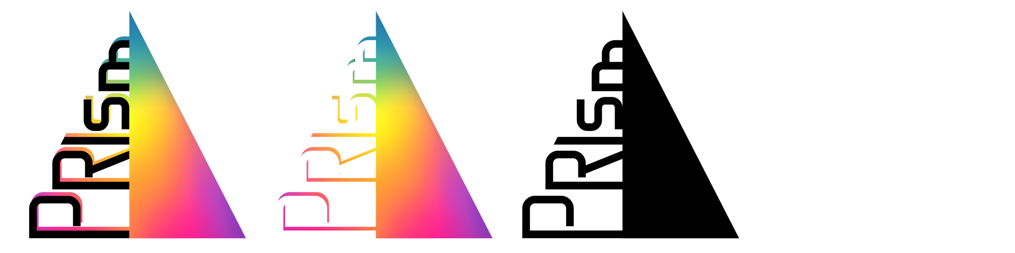
For the logo of Studio Prism, we wanted to try something with a triangle. As we first decided on the name "Prism", which in our case stands for "unity in diversity". This meant that we wanted to symbolize how different strengths (colors of a rainbow) would be combined in one strong team (white). So at first we were thinking about Pink Floyd kinda logos, where there's a triangle with beams of light coming in and going out. However, this didn't feel original, so we wanted to try some other things. In Creative Iterations you can see the different ideas we had.

Wesley had the idea to have one half of a triangle, and then have the name Prism sideways in the empty half. After asking fellow students what logo design they liked best, and thinking about what we liked best, we decided to go with the logo very similar to the one shown below. After some feedback from Jan and Josh, I finalized the logo. You can try toggling between light mode and dark mode to see how the light and dark versions of the logo look like.
showing the end result of the logos
Brand Book:
For our studio, we also needed a brand book. This brand book would basically contain the identity and style of our "brand". Logo, fonts, colors and tone of voice are all included. Wesley made the brand book and asked us multiple times what he could improve. As I've never really heard of a brand book before, and I didn't feel like I contributed much to it. One thing I did do was provide the content for the logo page, like a template of how to use the logo in documents or pages. I also found the font that I used for in the logo, and this font has been incorporated in the brand book. Furthermore when we decided that we wanted to have a glassy look for our studio, I found out how to accomplish this. But I was less involved in making the brand book itself. Open in new tab
Mobile Transport App:
For almost every project, you're making a product for a certain target audience. This means that the product needs to comply with the wishes, wants and needs from that target group, as they are the ones who will need to use your product. Its important to do research among this group, to find out what they want and don't want.

We have had a couple of instances where we needed to make a sort of project, where we also needed to do this research. An example is the public transport app. We already got three personas handed to us, and we needed to make a public transport app that would fit for them. The personas were all very different, with different wishes. But as of course an app for public transport would be used by a very wide range of people, we needed to keep every wish in mind.

So our next step was to do competitor analysis, checking how apps like NS or 9292 work. We then noted what complaints are about these apps from quick small interviews from students, as they were the easiest to find.

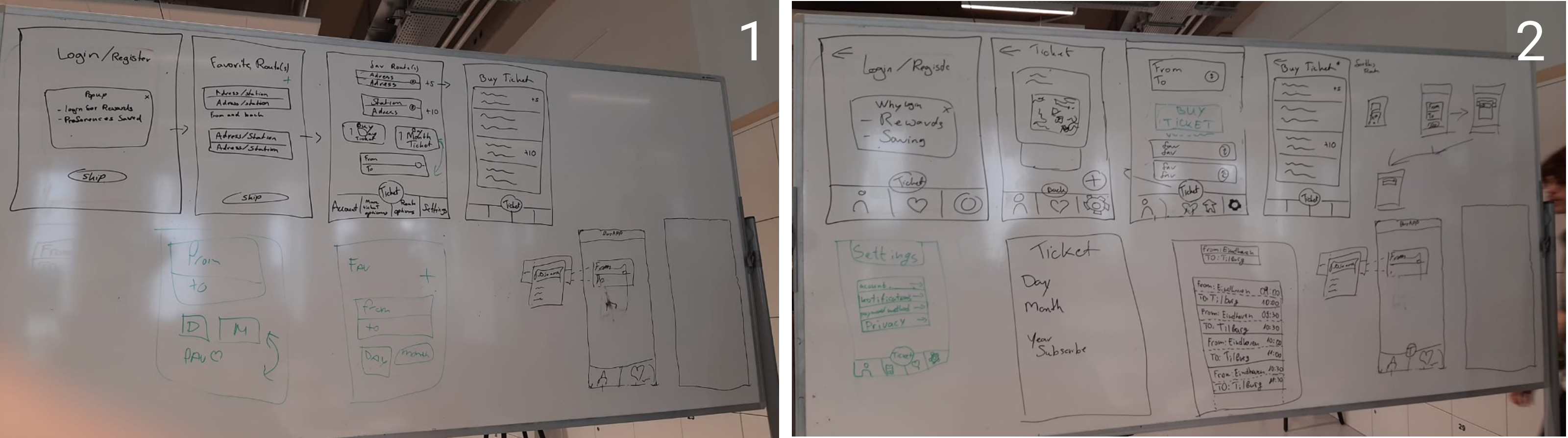
We then started sketching a low fidelity prototype on the whiteboard. We all had input on everything, and eventually got a couple of “app screens”, as depicted in 1. When we asked a couple of classmates what they thought of it, we heard that a couple of screens were too complicated. In the beginning we thought that having a logon screen would be nice, as they you can sync your preferences with multiple devices, or have a backup. But after some feedback we got to know that many people actually really dislike these “mandatory logins” and “onboarding”. After this, we thought of making logging in optional, and putting less focus on the onboarding and more on the actual interface, as shown in 2. In this process, I was responsible for the placement of multiple buttons and elements in places that I thought were more logical, like where to enter the start and end point of a route, and where to put a “Buy Ticket” button.
showing the whiteboard sketch low-fi prototype
We then transformed this second iteration of the prototype into a mid/hi-fi prototype inside Figma (3) and went for feedback again. The rest of the progress (iterations) can be found in Creative Iterations. Open Figma Prototype
Concept Document:
When we kicked off our project, the Fairytale Festival, we dove into defining our work through a concept report that tracks our journey from interviewing the Ontdek Fabriek in Eindhoven to shaping our first big idea.

Step-by-Step Progress
We started by gathering info from the Fairytale Festival team to understand what was needed. Our research into kids' activities included insights from the Ontdek Fabriek and AI-generated interviews. We also looked at successful models like Nemo and Efteling.

From all this, we made mindmaps, empathy maps, personas, and affinity maps to guide our concept development. To make sure our ideas matched the project's goals, we used "How Might We" questions and a Lotus Blossom ideation process to refine them.

Our research gave us tons of ideas on how to make an immersive, hands-on experience for our young audience. We've outlined our first concept and are pumped to keep building and testing it. Open Concept Report
Rick and Morty API:
Another assignment we had was to make a page that gets data from an API and displays it in a page. This specific API contains all kinds of characters from Rick and Morty. Their names and image links area all in the API, so this way I made "cards" on the page with each name and image. I haven't implemented all the features like searching or filtering, and while I do still plan to do this, I haven't found the time to do it, as I was a bit more invested in other projects. I plan to first add some sort of "if" to it where it first searches for the "Pickle Rick" and then display only that one. When I have that working, I can try adding some sort of search field that lets you enter a search word and that it then goes through the JSON to find that specific one. Rick and Morty cards
Progressive Web App:
An assignment I was really looking forward to was making a Progressive Web App (PWA). This way you can "install" a website as if it could be a native app. When you then launch this "app", it will open in a separate window. PWA's also have more possibilities when it comes to permissions. For instance camera permissions, or the permission to send notifications. The first workshop to make a PWA was mainly getting the right files in the right place. And as there are not really different ways to do this, these steps were mostly copy-paste from the CodePen from Maikel. However, instead of trying to make a sample site he prepared into a PWA, I immediately wanted to try it our on my portfolio website. At first I had some trouble getting the manifest active, but that was because I didn't link it properly in the html. At first, the teacher thought it was because I had my manifest file in a subfolder, and that this would never work. But after proper linking in the index.html, everything worked, much to the surprise of the teacher.

A couple days later, we would learn how to send notifications. The way these notifications basically work is that when the website loads, the browser knows that the website has notification options, and asks the user if they allow this. Any website can ask you to receive notifications when you load the page, except on iOS. On iOS, a user first has to add the website as PWA, and then a user input (like clicking a button) is needed to prompt the user if they want to allow notifications. So besides implementing the standard prompt into my portfolio website, I also had to implement a button which would trigger the same script, just for it to work on an iOS PWA. I eventually had it working well, so that if you haven't given permission yet, you can click the little bell icon in the top right corner, to prompt the user with a permission request again.

But now, something that went a little bit less smooth. The actual notification. We had to generate a vapid key, and copy-paste it in a couple places, then run a JS script to send a notification. This quickly worked on my laptop. However, even when I gave permission to my iOS PWA, it didn't display any kind of message. So I first started looking if there were some Apple-like quirks that limit or change the way notifications can be sent. I couldn't find anything specific about this, as notifications should just be possible since iOS 16.4. I went back to the script that would send the message out, and saw that it said "-- Message NOT sent to https://web.push.apple.com/(...)" in the terminal, without giving me a reason. I checked the code itself and saw that there was a ".catch(error => { console.log(`-- Message NOT sent to (...)`);". I then thought, why not include the error message it catches anyway in the message it gives in the terminal? So I added a little line where it also includes the error message, and after running the script again, I knew that the reason was "WebPushError: Received unexpected response code". I copy-pasted this in Google, included iOS in the search result, and this was the first result that popped up. I then found out that the information from the vapid key is formatted in a way that Apple's notification service doesn't recognize. Where the directly copy-pasted line was "mailto: <jannes2001@outlook.com>", it needed to be formatted like "mailto:jannes2001@outlook.com", without brackets or spaces. After changing this one line, everything worked and my iPhone also got notifications from the PWA. I also edited the service worker file to not check if the notification has an empty title or message, as I also wanted to try what happened when I don't enter anything in the send script. Then it will just display a generic empty notification, depending on the device.
Blender:
We had a couple of workshops on how to make different things in Blender. And I'm not talking about smoothies, but 3D objects that consist of multiple parts, have indentations or that move around.
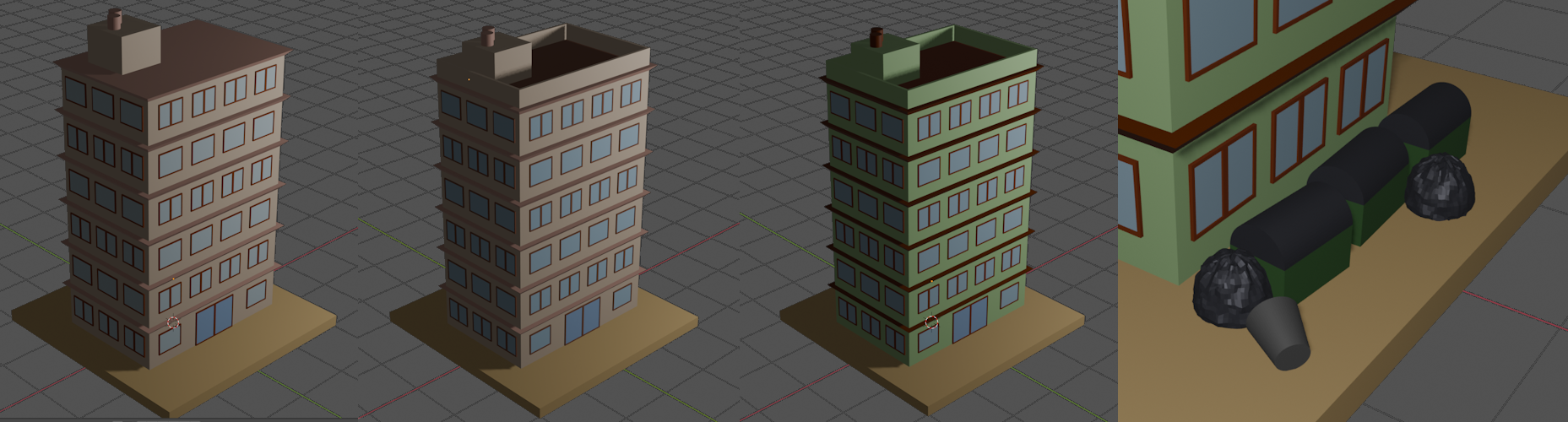
I actually attended two workshops for the building from two teachers, and even though the goal was the same, they both had different approaches to get there. I noticed how I understood more from the second workshop, and after spending some more time at home making a building, I ended up with the results you can see below. It became a little bit cartoon-ish, by using a minty chocolate color scheme.

For the dice I learned how to basically cut out shapes with another object. This is ideal to create holes or indentations. I laso learned how to give bones to an object. this is what enables an object to eventually move. While I haven't been able to get animations working properly yet, it's nice to see what all is possible. I will have to take a look online on what the steps are to get the sack of bones moving, as I would like to try out more things in Blender. With the buttons below you can explore the building, dice and the weird tentacle that currently doesn't move. You wouldn't download a building or a dice or a, uhh, tentacle?
showing the different iterations of my blender building
That's all
folks!
Scroll up button